Dots and small motifs3 min read
An orderly dot design depends as much on the empty gaps as on the dots themselves. Practise a small grid with conventional nail polish before covering a whole set. Choose a dot size you can repeat, map the centre line and allow the pattern to remain simple enough to read.
Read the guide ↗
Dots and small motifs3 min read
A small daisy can be constructed from a centre and a ring of petal marks. The challenge is leaving enough separation for the flower to remain readable. Practise one blossom before creating a cluster, and use placement rather than more detail to make the miniature design interesting.
Read the guide ↗
Lines and geometry3 min read
A diagonal split turns one nail into two colour fields. Its effect depends on the angle, the relative areas and the contrast between the colours. Plan those relationships on an outline first, then practise a controlled boundary without assuming a perfectly straight line is the only successful result.
Read the guide ↗
Lines and geometry3 min read
A checkerboard is a repeated grid, so a small alignment error can affect the whole pattern. Keep the design manageable by choosing fewer cells and one accent area. Map the grid before filling alternate spaces, and let the nail’s curved outline crop the pattern naturally.
Read the guide ↗
Curves and colour3 min read
An open arch uses the unpainted or visibly clear area as part of the design. The outline and the gap need to work together. Plan the arch on a practice outline, choose a manageable line width and avoid filling every empty area merely because it is available.
Read the guide ↗
Dots and small motifs3 min read
A miniature heart needs a recognizable upper notch and lower point more than elaborate detail. Build it from a simple plan using conventional lacquer, then choose its placement. Practise one clear heart before repeating it, because a crowded cluster can become less readable than a single well-spaced motif.
Read the guide ↗
Dots and small motifs3 min read
A tiny cherry pair uses two round shapes and a connecting stem as a simple visual shorthand. The challenge is keeping the parts distinct at a small scale. Plan the fruit size first, then add a thin stem and optional leaf without turning the motif into a crowded patch.
Read the guide ↗
Curves and colour3 min read
A wave line can feel calm, energetic or graphic depending on its route and thickness. It does not need to imitate water literally. Plan one curve, practise its turns and decide whether a second line supports it before filling the surface with repeated swirls.
Read the guide ↗
Curves and colour3 min read
A half-moon motif creates a curved colour field near the base of the nail. Its size is a design choice rather than a requirement to follow the natural visible crescent. Plan a clear painted shape on the nail surface and compare how much of the main colour remains visible.
Read the guide ↗
Lines and geometry3 min read
A lattice uses crossing lines while leaving the spaces between them visible. The difficulty lies in keeping intersections from becoming heavy spots. Start with a sparse grid, plan the line order and compare the empty cells before deciding whether the pattern needs more detail.
Read the guide ↗
Curves and colour3 min read
A gradient changes gradually between colours rather than dividing them with a hard line. With conventional lacquer, a sponge can build a soft transition in light applications. Practise the overlap on a swatch, keep the colours legible and avoid trying to create the entire effect with one heavily loaded press.
Read the guide ↗
Organic patterns3 min read
Marble-inspired nail art is an abstract interpretation of branching lines and quiet colour variation. It does not require reproducing a particular stone. Plan a few irregular routes, leave large areas calm and keep the veins varied enough that the design does not become a tidy lattice.
Read the guide ↗
Dots and small motifs3 min read
A four-point sparkle can suggest a star with only a few marks. Its centre, long axis and tapering ends carry the shape. Practise one readable symbol before adding smaller companions, and distinguish a deliberate sparkle motif from a conventional five-point star outline that requires a different construction.
Read the guide ↗
Organic patterns3 min read
A terrazzo-inspired motif uses irregular small shapes scattered across a base. It should have variety in size and direction without becoming an undifferentiated crowd. Practise a limited palette, place the largest shapes first and preserve the background as part of the design.
Read the guide ↗
Organic patterns3 min read
A leaf sprig can be built from a fine stem and a few small tapered marks. The design works when the stem remains visible and the leaves have room to turn. Practise the direction of each part before adding another sprig or trying to represent a specific plant.
Read the guide ↗
Curves and colour3 min read
Nested arcs create a rainbow-like motif through repeated curves. The colour order can be literal or entirely personal, but the spacing needs to remain readable. Begin with a few bands, choose a scale suited to the surface and avoid shrinking the central gap with each correction.
Read the guide ↗
Organic patterns3 min read
A leopard-inspired print is a stylized pattern of irregular spots and open outline marks. It should not become a page of identical circles. Practise a few varied forms, use a limited palette and leave enough base visible that the pattern remains readable on a small surface.
Read the guide ↗
Dots and small motifs3 min read
A celestial motif combines a crescent with a few small marks that suggest stars. The moon should remain the main shape rather than disappear in a field of equal dots. Plan its curve and the surrounding space, then decide how many companions the surface can hold.
Read the guide ↗
Lines and geometry3 min read
Triangles bring strong directional points to a miniature composition. A cluster works when those directions and gaps are chosen rather than accidental. Start with one main triangle, add smaller companions and test whether filled shapes or outlines communicate the effect more clearly with your current brush control.
Read the guide ↗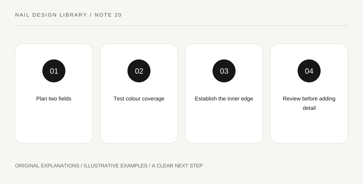
Lines and geometry3 min read
A narrow side panel divides the surface vertically or along a gentle curve. Its effect depends on width and contrast, not a promise to change the apparent shape of the wearer’s nails. Plan the two fields, practise the boundary and keep the panel wide enough to read without becoming the whole design.
Read the guide ↗