Use a side panel to create a clear colour-blocked nail design
A narrow side panel divides the surface vertically or along a gentle curve. Its effect depends on width and contrast, not a promise to change the apparent shape of the wearer’s nails. Plan the two fields, practise the boundary and keep the panel wide enough to read without becoming the whole design.
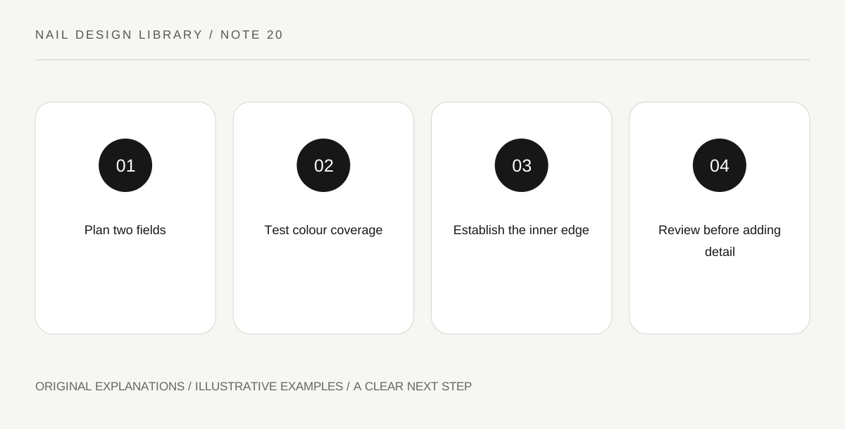
Original explanatory diagram. Read the full method and limitations below.
Define the two fields
Draw a nail outline and reserve a strip along one side. Compare a narrow panel with a broader one. The narrow version makes a small accent; the broad version creates a more equal division. Decide which colour should lead before adding an outline or another decorative element.
The boundary can be straight or slightly curved. Those choices produce different relationships with the outer shape. Do not assume the line must imitate the nail’s side exactly. It is a painted composition on the surface, and it should remain distinct from surrounding skin.
Test contrast and coverage
A dark panel over a pale base can create a graphic edge, while similar values create a quieter change. Opacity matters: a translucent panel may modify the base into a third colour rather than appear as a separate field. Test the dried pair on a practice swatch.
Choose a compatible base and follow application instructions. A design does not need a thick colour field to be successful. If coverage requires more product than you can control comfortably, change the pair or simplify the area rather than treat repeated heavy coats as the only solution.
Paint the inner boundary first
On a swatch ready for detail, use a suitable brush to establish the panel’s inner edge with a controlled mark. Fill the area between that edge and the planned outer margin. Working from the visible boundary helps keep width intentional rather than letting the panel grow with each stroke.
Keep lacquer on the intended nail surface when moving from practice to natural nails. Do not use skin as an extension of the colour field. If the boundary becomes uneven, identify the section that matters visually and avoid repainting the entire strip until it is much wider than planned.
Choose whether the panel needs a second detail
A small dot, short line or narrow contrasting edge can be added, but each changes the hierarchy. Compare the plain two-field version first. Strong contrast may already make the design complete, while another detail can create a crowded narrow area.
For an exercise, make narrow and broad versions with the same colours and boundary route. View them at normal distance and choose the field relationship you prefer. Finish according to compatible product directions and record the ratio descriptively, such as a small side accent, rather than a universal measurement for every surface.
Illustrative side-panel choice
A learner uses a soft-grey base with a dark side strip. The first attempt’s repeated corrections make the strip nearly half the surface. A new swatch begins with a planned inner boundary and controlled filling. The smaller panel becomes the desired accent. They omit a metallic outline because the contrast is already clear.
Practical checks
Optional checkboxes save only in this browser.
Questions that come up
Will a side panel guarantee a longer-looking nail?
No. This lesson makes no body-shaping promise. Choose the line, width and contrast because you enjoy the composition, and evaluate it on the actual surface.
Should both hands use the same side placement?
You can mirror the design or keep a consistent directional placement. Sketch both approaches first and choose intentionally. There is no universal requirement beyond the effect you want and your practical control.
References and scope
These sources support the factual background. Examples and exercises are original illustrative teaching material. References do not imply endorsement.
- FDA: Nail care products — Cosmetic scope, following labels and warnings, ventilation, ignition risks and reactions.
- Essie: Mastering nail art — Conventional polish tools, controlled dots, stripes, sponge gradients and compatible finishing.
- Getty Museum: Principles of design — Spacing, repetition, emphasis and visual rhythm in original miniature compositions.
- Getty Museum: Elements of art — Line, shape, colour value and negative space.
- OPI: Conventional nail-lacquer application example — Manufacturer example of base coat, thin colour layers and compatible top coat; no adoption of wear-duration claims.