Design an open arch with clear negative space
An open arch uses the unpainted or visibly clear area as part of the design. The outline and the gap need to work together. Plan the arch on a practice outline, choose a manageable line width and avoid filling every empty area merely because it is available.
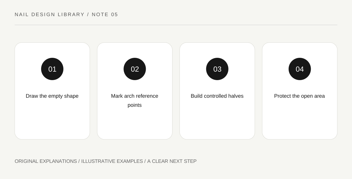
Original explanatory diagram. Read the full method and limitations below.
Define the space you want to preserve
Negative space is the area around or within a form. In this design, a clear inner area makes the arch readable. Draw the empty shape first, then its coloured boundary. This reverses the habit of deciding only where polish should go and leaving the rest to chance.
A clear appearance can come from an appropriate transparent base or the design’s chosen uncovered area, depending on the products and your preference. Follow the actual application instructions. The lesson concerns composition, not a claim that any particular clear product improves nail health.
Choose the arch’s opening and height
A tall narrow arch creates a different rhythm from a low broad one. Compare both on the same-sized outline. Keep enough room between the arch and the outer edge that the line does not become an accidental border unless that is what you want.
Mark the highest point and two endpoints in the drawing. Those reference points make the curve easier to plan. The arch does not need to follow the cuticle exactly, and polish should remain on the intended nail surface rather than being used to trace surrounding skin.
Build the curve in controlled parts
On a practice swatch with a ready compatible base, use a suitable detail brush to make one side of the arch, then the other. A single sweeping stroke is optional, not proof of greater skill. Two controlled halves can be easier to manage while you learn the shape.
Keep the line width reasonably consistent by controlling loading and pressure. If one side becomes broader, decide whether a small adjustment helps before enlarging the entire arch. Repeated correction can shrink the negative space until the design becomes a solid patch.
Review the empty area at normal distance
The inner gap should remain legible when you are not inspecting it close up. Strong colour contrast can help a fine line remain visible; a quiet colour may need a slightly broader mark. Test that relationship on the swatch instead of assuming the thinnest possible line is always best.
For an exercise, compare a high arch and a low arch with the same line width and colour. Describe which has more open space and which feels more enclosed. Finish only as the compatible products allow, and keep the chosen sketch as a placement reference rather than a template that every nail must reproduce exactly.
Illustrative open-space revision
A learner paints a broad dark arch around a small clear centre and finds the gap disappears from normal distance. The next swatch uses the same outer position but a thinner boundary, leaving a larger opening. They choose the second version and stop adding details inside it. The design becomes clearer because the empty area is preserved.
Practical checks
Optional checkboxes save only in this browser.
Questions that come up
Does negative space mean no base coat?
Not necessarily. The visual effect and the product system are separate. Use an appropriate base and follow its instructions; a clear appearance can still involve a compatible transparent layer.
Must both sides of the arch match perfectly?
No. Aim for an intentional overall shape and a clear gap. Small differences can remain, while repeated attempts to equalize them may make the line too heavy and erase the design’s main feature.
References and scope
These sources support the factual background. Examples and exercises are original illustrative teaching material. References do not imply endorsement.
- FDA: Nail care products — Cosmetic scope, following labels and warnings, ventilation, ignition risks and reactions.
- Essie: Mastering nail art — Conventional polish tools, controlled dots, stripes, sponge gradients and compatible finishing.
- Getty Museum: Principles of design — Spacing, repetition, emphasis and visual rhythm in original miniature compositions.
- Getty Museum: Elements of art — Line, shape, colour value and negative space.