Create a fine-line lattice with fewer intersections
A lattice uses crossing lines while leaving the spaces between them visible. The difficulty lies in keeping intersections from becoming heavy spots. Start with a sparse grid, plan the line order and compare the empty cells before deciding whether the pattern needs more detail.
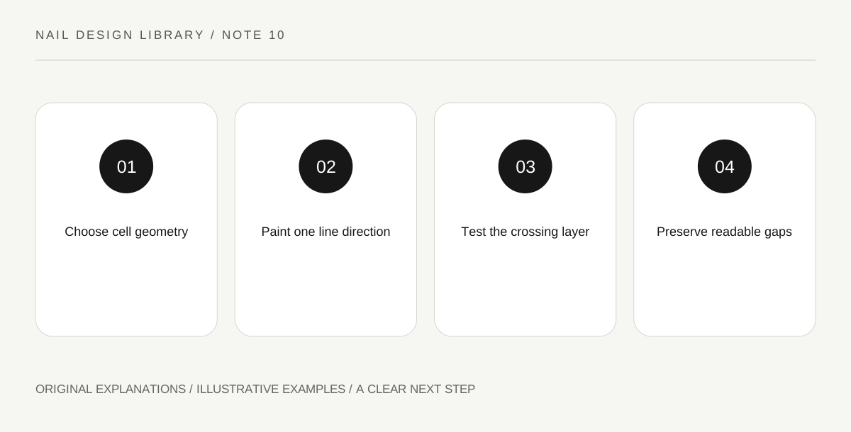
Original explanatory diagram. Read the full method and limitations below.
Choose the cell shape
Straight vertical and horizontal lines create rectangular cells; crossing diagonals can create diamonds. Those are different designs, so choose one first. A curved nail outline will crop the outer cells naturally. You do not need to force every edge area into a complete repeated shape.
Sketch a sparse and a dense version at actual size. Count intersections rather than only lines: each crossing adds a place where polish can accumulate. Fewer lines can produce a more readable design and a more manageable practice task.
Establish the first direction
Over a ready compatible base on a practice swatch, paint a small number of parallel lines with a suitable detail brush. Keep their spacing visible. The first set creates the rhythm that the crossing set will relate to, so inspect it before continuing.
Use controlled loading and short strokes where needed. If the lines are too thick, adding the crossing set will not make them finer. Try another swatch with a lighter mark or wider spacing. The objective is a clear structure, not completing a complicated plan despite evidence that its scale is unsuitable.
Cross without building a knot
Let the first lines reach the readiness required by the products before adding the second direction. A wet crossing may pull one line into another when you want separate edges. On a practice swatch, test how the lacquer behaves rather than use a fixed time copied from a different product.
Keep the crossing stroke consistent through the intersection instead of pausing with extra lacquer at the centre. If a spot becomes heavier, decide whether it matters from ordinary distance. Repeated repair can create a raised visual knot that is more prominent than the original small variation.
Use contrast to preserve the gaps
A strongly contrasting line remains visible at a smaller width, while a low-contrast lattice may need more space or a slightly broader mark. Observe the actual dried combination. Metallic or shimmering lines can also change with light, so check the design under ordinary viewing conditions.
For an exercise, compare rectangular and diamond lattices using the same number of lines. Identify which leaves clearer spaces on the actual outline. Choose one and omit extra dots at the crossings unless they serve a new deliberate design. Finish only when a compatible top coat can be applied without dragging the structure.
Illustrative intersection study
A learner plans five lines in each direction, then realizes the small cells disappear. A second swatch uses three lines in each direction. The intersections remain lighter and the base colour is visible. They prefer a diamond arrangement because the cropped edge cells look intentional on the outline. The improvement comes from fewer crossings, not a more expensive brush.
Practical checks
Optional checkboxes save only in this browser.
Questions that come up
How do I make a lattice look less crowded?
Reduce the number of lines, increase spacing or lower contrast deliberately. Change one variable on a swatch so you know which adjustment improves readability.
Should every crossing have a decorative dot?
No. A dot adds emphasis and changes the pattern. Compare the plain lattice first; its line-and-space relationship may already provide the complete design you want.
References and scope
These sources support the factual background. Examples and exercises are original illustrative teaching material. References do not imply endorsement.
- FDA: Nail care products — Cosmetic scope, following labels and warnings, ventilation, ignition risks and reactions.
- Essie: Mastering nail art — Conventional polish tools, controlled dots, stripes, sponge gradients and compatible finishing.
- Getty Museum: Principles of design — Spacing, repetition, emphasis and visual rhythm in original miniature compositions.
- Getty Museum: Elements of art — Line, shape, colour value and negative space.