Arrange terrazzo-inspired chips with deliberate variety
A terrazzo-inspired motif uses irregular small shapes scattered across a base. It should have variety in size and direction without becoming an undifferentiated crowd. Practise a limited palette, place the largest shapes first and preserve the background as part of the design.
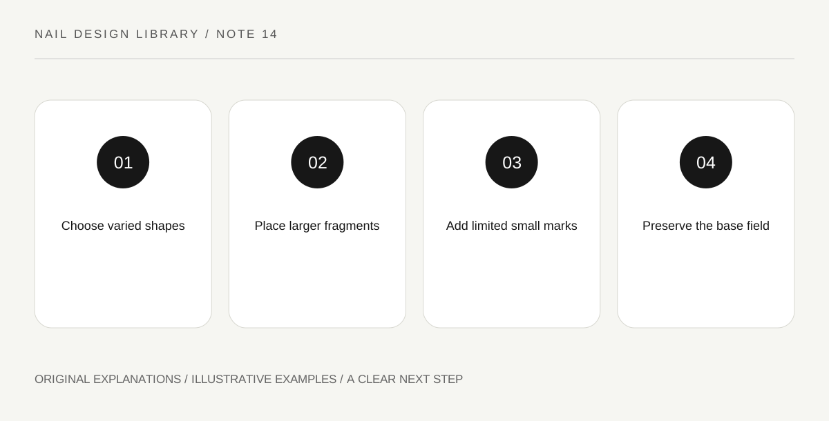
Original explanatory diagram. Read the full method and limitations below.
Choose a limited set of chip shapes
Draw a few irregular triangles, short slivers and rounded fragments on a practice outline. They are an illustrative surface pattern, not a claim about a particular architectural material. Avoid making every chip a perfect circle if you want the design to differ from polka dots.
Choose two or three chip colours with a base that keeps them visible. A limited palette makes it easier to notice shape and spacing. Test the actual dried combination because a transparent colour may change over the base and become less distinct than expected.
A fragment near the edge can be partly cropped, suggesting the pattern continues beyond the outline. Leave that crop intentional instead of squeezing every chip inward and crowding the centre.
Place the largest marks first
Begin with a few larger fragments at different angles. Leave uneven but intentional spaces between them. These marks establish the composition, so do not fill every open area immediately. The smaller pieces will have a supporting role rather than compete at the same size.
On a swatch with a ready compatible base, use a suitable detail brush and modest lacquer loading. A fragment can be made from a few controlled strokes. Keep corners simple; intricate tiny edges are unlikely to remain visible at normal distance and can encourage unnecessary overworking.
Add small fragments without equal spacing
Place a few smaller marks near some gaps while leaving others open. Equal spacing and identical size can turn the effect into a regular repeat. A varied distribution should still be intentional: look for a useful balance of busy and quieter areas.
Rotate the swatch to inspect the whole pattern. If one area is crowded, do not automatically crowd the opposite side to match. You may prefer an asymmetrical cluster. The base field contributes to the design, so imbalance can sometimes be resolved by stopping rather than adding.
Check the pattern at its real scale
Close-up photographs make tiny fragments seem more important than they are in ordinary view. Look at the design at hand distance and identify whether the chips remain separate. If they merge into a speckled field, reduce the count or increase contrast in the next attempt.
For an exercise, make one sparse and one dense version using the same shapes and colours. Record which reads as distinct fragments and which as texture. Either can be chosen deliberately. Finish according to compatible product instructions and avoid claiming that the decorative effect changes the nail’s physical structure.
Illustrative fragment arrangement
A learner places three larger dark fragments on a pale swatch, then adds small muted-colour slivers. They leave one broad gap instead of filling it. A second dense version looks like general speckling from normal distance. They choose the sparse version because the irregular chips remain identifiable, showing that variety and empty space matter more than a large number of marks.
Practical checks
Optional checkboxes save only in this browser.
Questions that come up
Do chips need to look random?
They can feel irregular, but you still choose size, angle and spacing. Deliberate variety is more useful than placing marks without looking at the developing composition.
Can I use real stone or craft fragments?
This lesson uses painted shapes with conventional cosmetic lacquer. It does not recommend adding unrelated materials to nails or assume that craft supplies are suitable for cosmetic use.
References and scope
These sources support the factual background. Examples and exercises are original illustrative teaching material. References do not imply endorsement.
- FDA: Nail care products — Cosmetic scope, following labels and warnings, ventilation, ignition risks and reactions.
- Essie: Mastering nail art — Conventional polish tools, controlled dots, stripes, sponge gradients and compatible finishing.
- Essie: Pebbled polka dots — Dots as a flexible motif with organic shape variation; the articles use their own compositions.
- Getty Museum: Principles of design — Spacing, repetition, emphasis and visual rhythm in original miniature compositions.
- Getty Museum: Elements of art — Line, shape, colour value and negative space.