Draw marble-inspired veins without turning them into a regular grid
Marble-inspired nail art is an abstract interpretation of branching lines and quiet colour variation. It does not require reproducing a particular stone. Plan a few irregular routes, leave large areas calm and keep the veins varied enough that the design does not become a tidy lattice.
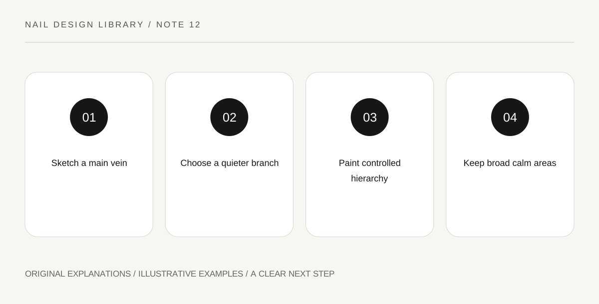
Original explanatory diagram. Read the full method and limitations below.
Choose the kind of abstraction
Look at a properly identified stone image if you want a visual reference, but treat the painted result as an original motif rather than a geological copy. This lesson uses a light base and fine branching lines. It does not identify minerals or claim that all marble has the same pattern.
Sketch one main vein with one or two smaller branches. Leave substantial empty areas. A small surface can become busy when every line receives several branches, so decide which route carries attention and which remains secondary.
Separate line variation from random scribbling
An irregular line can change direction and width while still following a clear route. Draw it first with a pen on a practice outline. Avoid equal spacing and repeated right-angle crossings if you want an organic effect. The design should have differences you can describe, not merely marks placed without intention.
Choose a vein colour with the contrast you want. Strong black on pale polish gives a graphic result; a softer grey may feel quieter. Test the actual dried pair. A subtle line that disappears can be revised through contrast rather than automatically thickened everywhere.
Paint the hierarchy on a ready base
Use conventional lacquer and a suitable fine brush over a compatible base that is ready for detail work. Paint the main route first, then decide whether a branch is necessary. Keep loading controlled so a turn does not become a large drop.
A branch can be thinner or shorter than the main line. This hierarchy helps the motif remain readable. Do not repair every discontinuity while the lacquer drags; a broken-looking vein may fit the intended abstraction, while repeated correction can turn it into a heavy stripe.
Stop before the quiet areas disappear
Step back after each added line and look from ordinary hand distance. If the pattern already suggests branching movement, more detail may reduce the effect. The base colour is an active part of the composition, not leftover space that must be covered.
For an exercise, compare one main vein with a version containing several equal veins. Keep the colours constant. Note which has a clearer hierarchy and which feels like a grid. Finish as the compatible products permit and describe the result as marble-inspired rather than claiming a realistic or professionally tested stone effect.
Illustrative vein hierarchy
A learner draws three equally dark parallel lines and finds the result looks striped. On the next swatch they use one broken curving route, a thinner branch and a large quiet area. The motif reads more organically. They keep the surface simple rather than add metallic lines to compensate for an unclear structure.
Practical checks
Optional checkboxes save only in this browser.
Questions that come up
Must I use water marbling for this effect?
No. This lesson is a dry-base line design using conventional lacquer. Water marbling is a different process with its own product behavior and is not required to explore a branching stone-inspired motif.
Why does my design look like a net?
The veins may be too equal in width, spacing or number of crossings. Reduce the routes, vary their roles and leave a larger uninterrupted base area on the next practice swatch.
References and scope
These sources support the factual background. Examples and exercises are original illustrative teaching material. References do not imply endorsement.
- FDA: Nail care products — Cosmetic scope, following labels and warnings, ventilation, ignition risks and reactions.
- Essie: Mastering nail art — Conventional polish tools, controlled dots, stripes, sponge gradients and compatible finishing.
- Getty Museum: Principles of design — Spacing, repetition, emphasis and visual rhythm in original miniature compositions.
- Getty Museum: Elements of art — Line, shape, colour value and negative space.